Graphics and Color
首页 » Graphics and Color
Comprehensive graphics and color support
KOMAI Corporation is more than willing to work with you to create design documents. By working with our professional design team, you’ll gain an in-depth understanding of our supported file formats, layout models, and parsing requirements to ensure your coordinated designs are presented perfectly.
We support multiple file formats, including PDF, PSD, AI, JPG, TIF, etc. In order to ensure the printing effect, please ensure that the images in your file are in CMYK format and the resolution is between 400~600 DPI. To help you jump-start your design process, we also offer custom art templates for you to download.
About design software
Popular design software on the market can help you get your design project off the ground. While you can choose from different types of tools for creating, Photoshop and Illustrator are undoubtedly the most common and easy-to-use choices.
If you are not familiar with these two software, it may be a bit difficult at first. However, don’t worry, each software provides official detailed tutorials. At the same time, we will also launch corresponding demonstration video products based on actual situations to help you quickly master key skills and become a design expert!

Die Cutting Line Guide
During production we use a sheetfed press, which means your multiple cards, multiple boxes or multi-page booklets can all be printed entirely on the same sheet of paper before being cut. To ensure that your design extends perfectly to the edge of each card or box while avoiding any critical parts being cut off, we typically set up our files with three different die-cut lines.
In the picture below you will see three different colored marking lines, each about 3 mm (0.12 inches) apart. What these lines do is:
- The innermost green line is the safety line. All key content, such as characters, logos, text, etc., should be placed within this line to account for possible minor trimming differences.
- The red line in the middle is the trim line. This represents the final size of the card or box after cutting.
- The outermost blue line is the bleed line. Graphics must extend to the bleed line to ensure no white borders show around the edges of the project, ensuring a clean and professional look to the print.
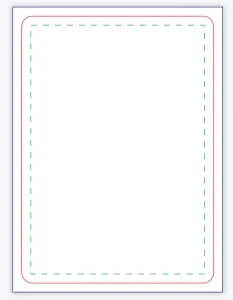
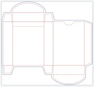
By following these guidelines, you’ll be able to create prints that are both beautiful and functional.
Special Decorative Surface Documentation Guide
For files with special decorative effects, such as hot stamping, local UV, embossing and embossed effects, separate design layers or files are required. This is to ensure that overprinting inaccuracies are not caused by stretching of the paper during different production processes. When designing, please pay attention to the following points:
- The decorative layer should be designed to cover the printed image to ensure precise alignment of the decorative effect with the printed content.
- The size of the foil image should be 0.1-0.15mm larger than the printed image to compensate for possible printing offset.
- The minimum line width in the foil image is 0.2 mm and the minimum line spacing is 0.4 mm to ensure clarity and detail of the decorative effect.
- For embossing and embossing lines on the box, the minimum width is 0.3 mm and the minimum line spacing is 0.4 mm to ensure sufficient pressure and visual effects.
Color settings
RGB vs. CMYK
Images displayed on the screen usually use the RGB color model. However, in printing we use CMYK – a subtractive color process based on ink or toner.
Therefore, we recommend that you convert the file to CMYK color mode and confirm the color effect before submitting it. This ensures that the printed color or image is as close as possible to the color or image you see on the screen, avoiding chromatic aberration.
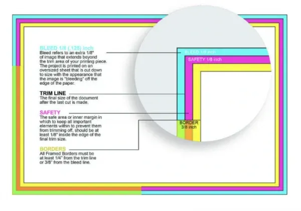
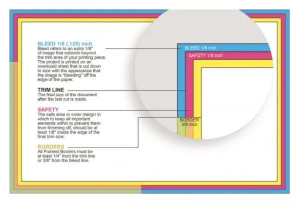
Common color issues in communicating with customers
When communicating with customers, we often encounter questions about color. First, the RGB color gamut is much larger than CMYK, so RGB colors displayed on the screen tend to be more vivid than CMYK prints. If the customer does not understand the actual effect of CMYK in advance, it will be difficult for us to ensure that the printed colors meet the expectations.
Secondly, due to the different configurations of each monitor, there will be color differences between screens. This means that the colors you see on your screen may differ from the colors we see on our screens.
In addition, the color of printed matter is affected by many factors, including printing equipment, printing environment, drying conditions, temperature and humidity, paper, ink, and storage conditions. Although no printing house in the world can guarantee that its color is 100% consistent with the document, we can promise that we will do our best to control the color difference within a level acceptable to our customers.
In order to ensure the best printing results, we strongly recommend customers to understand the CMYK color gamut and convert to CMYK color mode before submitting files. This way we can more accurately predict and adjust the color of our prints to meet our customers’ expectations.
Rich black and standard black
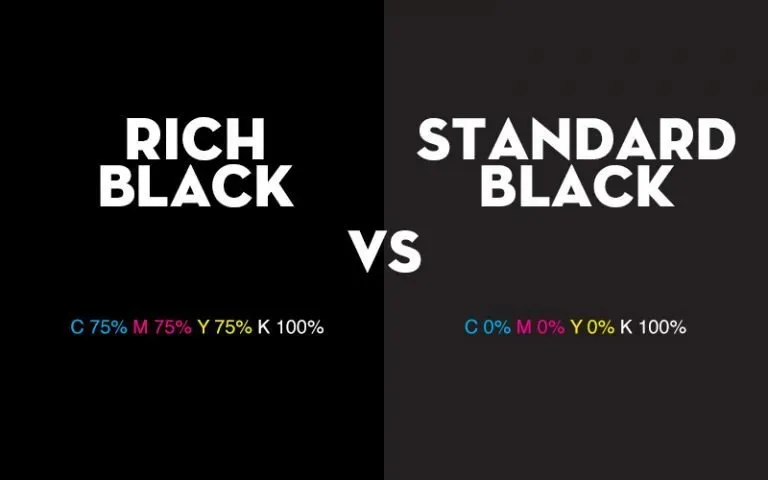
There are essential differences in the way black is expressed in black and white printing and CMYK printing. The black printed using pure black ink (100% K) is called “standard black”, while the black printed using a mixture of four CMYK inks is called “rich black”.
- Why choose rich black
Rich black uses a wider variety of inks, so its color depth and saturation are deeper and richer than standard black, which relies solely on black ink. The difference between the two may not be obvious when viewed individually; however, once they are compared side by side or viewed in an actual print, the difference becomes significant.
Some customers feel that the black is “not dark enough” or that there is “color difference” during the printing process. This is often because they have not selected rich black, or they have used a mix of standard black and rich black in their designs. So if your design contains a lot of black elements, be sure to double-check the value of each color in an all-black block to ensure color consistency and depth.
- Why use standard black?
In CMYK printing, we need to use four CMYK printing plates to complete the printing process. Small misalignments between the four printing plates can cause slight color smearing around the text, a phenomenon known as “ghosting.” This is especially true when printing small fonts and fine lines in dark black.
Therefore, if your design contains small fonts or fine line art, we recommend using standard black. Because standard black only requires one printing plate to complete printing, ghosting problems are avoided.
Use of white ink documents
White ink is used primarily as a base color in this scene. For common materials, such as white cardboard, white paper, coated paper, offset paper, etc., there is usually no need to lay additional white ink as the background color. But when it comes to colored paper, laser paper, or other specialty materials, the use of white ink becomes crucial.
Applying white ink before color printing can significantly enhance the brightness of printed colors and increase the thickness of the ink layer, giving printed matter a more three-dimensional effect. In addition, white ink increases light reflection and helps reduce discoloration because white ink has a better affinity for plastic than other color inks.
If your design requires the use of colored paper, laser paper, or other specialty materials, and you wish to take advantage of the above benefits of white ink, then you will need to create an additional white ink graphic file to clearly indicate where we need to print white.

The importance of resolution
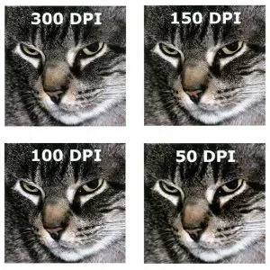
In the RGB color model, we usually use PPI (pixels per inch) to describe resolution. In CMYK mode, we more commonly use dpi (dots per inch) as the unit. For files containing complex vector graphics, in order to ensure print quality, we recommend that the resolution of the file you submit should be between 300~600 dpi. Within this range, we have greater control over the actual print effect, ensuring your project is clear and perfect.
Note: During the design process, please be sure to set the resolution at the beginning instead of adjusting it after the design is completed. For example, upsampling a file from 100dpi to 300dpi does not actually increase the resolution of the file, although the number of pixels appears to have increased. Therefore, the printed result may appear blurry.
Confidentiality and Disclosure Agreement
We emphasize that during the entire design and production process, we will not modify or appropriate any of your works without your explicit permission. Typically, we will only quote or display portions of your printed images or parameters for promotional purposes. If you still have concerns about this, we support signing separate confidentiality and disclosure agreements with customers to ensure that their copyrights are fully protected.
The specific content of the agreement is as follows:
- We promise not to disclose that you are a client of our company.
- We are prohibited from using any information relating to your work in any publications, promotional materials or advertising. This includes, but is not limited to, any references in social media, print, photographic or video material.
- We will take reasonable care to prevent the unauthorized use, dissemination or disclosure of any Confidential Information.
- We are committed to protecting your rights and ensuring that your work and confidential information are properly managed and protected.
Are you ready to start your innovation journey?
We aspire to be the world’s leading card manufacturer. We understand the importance of quality and will never sacrifice quality for the sake of quantity.
Let our team of professionals bring your personalized playing cards, tarot decks or table game cards to life. Here, your imagination is almost limitless and the customization possibilities are endless.
If you are eager to learn more about our customized services, please feel free to contact us. We eagerly look forward to working with you to realize your creative vision.
